Layouts in WPF
Types of Layouts:
1.Grid Panel
2.Canvas
3.Stack Panel
4.Wrap Panel
5.Dock Panel
1.Grid Panel
Namespace : System.Windows.Controls.Grid
Major properties of grid are RowDefinitions, ColumnDefinitions,ShowGridLines,RowSpan and ColumnSpan.
The Grid control, much like its cousin the System.Windows.Forms.TableLayoutPanel is far more flexible for situations where the controls are likely to grow and shrink and shift around adjacent controls. Unlike TableLayoutPanel, the Grid can hold more than one control within a cell.
Here absolute positioning within a cell is possible using the Margin property on the element.
anchoring can be achieved using the Grid control and combinations of Margin, VerticalAlignment, HorizontalAlignment,Grid.RowSpan and Grid.ColumnSpan for multiple controls.
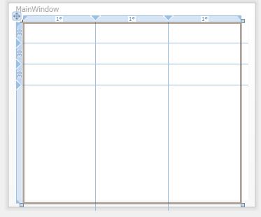
Designer Code:
        <!--Window1.XAML-->
        <Grid Height="259" Width="312">
        <Grid.ColumnDefinitions>
            <ColumnDefinition />
            <ColumnDefinition />
            <ColumnDefinition />
        </Grid.ColumnDefinitions>
        <Grid.RowDefinitions>
            <RowDefinition Height="30" />
            <RowDefinition Height="30" />
            <RowDefinition Height="30" />
        </Grid.RowDefinitions>
        </Grid>
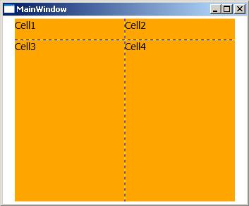
      <!--Window1.XAML-->
      <Grid Height="259" Width="312" ShowGridLines="True" Background="Orange">
      <Grid.ColumnDefinitions>
            <ColumnDefinition />
            <ColumnDefinition />
      </Grid.ColumnDefinitions>
      <Grid.RowDefinitions>
            <RowDefinition Height="30" />
            <RowDefinition Height="30" />
      </Grid.RowDefinitions>
      <TextBlock FontSize="14" Grid.Row="0" Grid.Column="0">Cell1</TextBlock>
      <TextBlock FontSize="14" Grid.Row="0" Grid.Column="1">Cell2</TextBlock>
      <TextBlock FontSize="14" Grid.Row="1" Grid.Column="0">Cell3</TextBlock>
      <TextBlock FontSize="14" Grid.Row="1" Grid.Column="1">Cell4</TextBlock>
      </Grid>
 Code Behind:
// Window1.xaml.cs
        //Add controls to grid from code
        ColumnDefinition Col1 = new ColumnDefinition();
        Grid1.ColumnDefinitions.Add(Col1);
        //Rows
        RowDefinition Row1 = new RowDefinition();
        Row1.Height = new GridLength(20);
        Grid1.RowDefinitions.Add(Row1);

        //controls
        TextBlock txtBlock1 = new TextBlock();
        txtBlock1.Text = "Cell1";
        txtBlock1.FontSize = 14;
        Grid.SetRow(txtBlock1, 0);
        Grid.SetColumn(txtBlock1, 0);
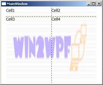
Image as Background of a Grid:
        <!--Window1.XAML-->
        <Grid Height="259" Width="312" ShowGridLines="True">
        <Grid.Background>
            <ImageBrush ImageSource="Images\win2wpf.JPG" Opacity="0.3"/>
        </Grid.Background>
        </Grid>
 GridSplitter:
        <!--Window1.XAML-->
        <Grid Height="259" Width="312" ShowGridLines="True">
        ....
        <GridSplitter
                ResizeDirection="Rows" Grid.ColumnSpan="2"
                Grid.Row="1"
                Width="Auto"
                Height="1"
                HorizontalAlignment="Stretch"
                VerticalAlignment="Stretch"
                Margin="0,0,0,28"
                Background="Red"/>
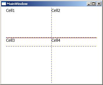
Setting a SharedSizingGroup on a Column or Row Definition will keep the Row/Column a uniform size with another Column/Row.
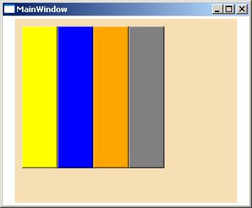
Canvas
Namespace : System.Windows.Controls.Canvas
Canvas is the most basic layout panel in WPF.Here elements are positioned using coordinates relative to the canvas.
Child Controls are placed in positions by setting attached properties - Canvas.Left, Top, Right, and Bottom.This does not support resize of child controls.
Designer Code:
        <!--Window1.XAML-->
        <Grid Height="259" Width="312">
        <Canvas Background="Wheat">
         <Button Width="50" Height="200" Background="Yellow" Canvas.Left="10"
         Canvas.Top="10" ></Button>
         <Button Width="50" Height="200" Background="Blue" Canvas.Left="60"
         Canvas.Top="10" ></Button>
         <Button Width="50" Height="200" Background="Orange" Canvas.Left="110"
         Canvas.Top="10" ></Button>
         <Button Width="50" Height="200" Background="Gray" Canvas.Left="160"
         Canvas.Top="10" ></Button>
        </Canvas>
        </Grid>
 Code Behind:
// Window1.xaml.cs
        //Add controls to canvas from code
        Button btn = new Button();
        Canvas.SetLeft(btn, 10);
        Canvas.SetTop(btn, 10);
        canvas1.Children.Add(btn);
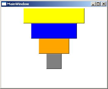
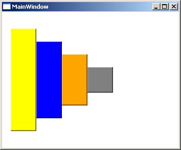
StackPanel
Namespace : System.Windows.Controls.StackPanel
StackPanel is somewhat similar to FlowLayoutPanel.
This uses the Orientation property to specify a Vertical or Horizontal flow of controls.
This will stretche the items inside it.
To prevent strech using Width, Height, HorizontalAlignment and VerticalAlignment.
Designer Code:
        <!--Window1.XAML-->
        <Grid Height="259" Width="312">
        <StackPanel Orientation="Vertical">
            <Button Width="200" Height="50" Background="Yellow" ></Button>
            <Button Width="150" Height="50" Background="Blue"  ></Button>
            <Button Width="100" Height="50" Background="Orange" ></Button>
            <Button Width="50" Height="50" Background="Gray"  ></Button>
        </StackPanel>
        </Grid>
 Code Behind:
        <!--Window1.XAML-->
        <Grid Height="259" Width="312">
        <StackPanel Orientation="Horizontal">
            <Button Height="200" Width="50" Background="Yellow" ></Button>
            <Button Height="150" Width="50" Background="Blue"  ></Button>
            <Button Height="100" Width="50" Background="Orange" ></Button>
            <Button Height="50" Width="50" Background="Gray"  ></Button>
        </StackPanel>
        </Grid>
// Window1.xaml.cs
        //Add controls to StackPanel from code
        Button btn = new Button();
        StackPanel1.Children.Add(btn);
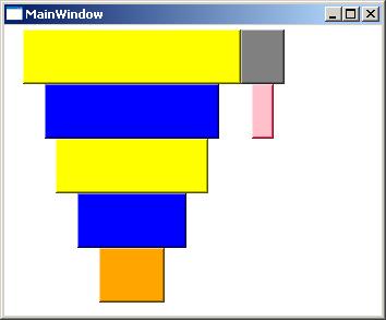
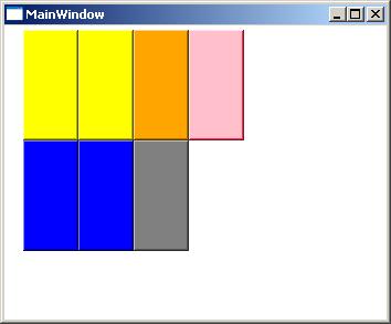
WrapPanel
Namespace : System.Windows.Controls.WrapPanel
WrapPanel is similar to StackPanel with additional feature. If elements that are stacked in panel horizontally or vertically don't fit in,then the remaining elements will wrap around.
Designer Code:
        <!--Window1.XAML-->
        <Grid Height="259" Width="312">
        <WrapPanel  Orientation="Vertical">
            <Button Width="200" Height="50" Background="Yellow" ></Button>
            <Button Width="160" Height="50" Background="Blue"  ></Button>
            <Button Width="140" Height="50" Background="Yellow" ></Button>
            <Button Width="100" Height="50" Background="Blue"  ></Button>
            <Button Width="60" Height="50" Background="Orange" ></Button>
            <Button Width="40" Height="50" Background="Gray"  ></Button>
            <Button Width="20" Height="50" Background="Pink"  ></Button>
        </WrapPanel>
        </Grid>
 Code Behind:
        <!--Window1.XAML-->
        <Grid Height="259" Width="312">
        <WrapPanel  Orientation="Vertical" Margin="0,0,2,0">
            <Button Height="100" Width="50" Background="Yellow" ></Button>
            <Button Height="100" Width="50" Background="Blue"  ></Button>
            <Button Height="100" Width="50" Background="Yellow" ></Button>
            <Button Height="100" Width="50" Background="Blue"  ></Button>
            <Button Height="100" Width="50" Background="Orange" ></Button>
            <Button Height="100" Width="50" Background="Gray"  ></Button>
            <Button Height="100" Width="50" Background="Pink"  ></Button>
        </WrapPanel>
        </Grid>
// Window1.xaml.cs
        //Add controls to WrapPanel from code
        Button btn = new Button();
        WrapPanel1.Children.Add(btn);
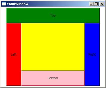
DockPanel
Namespace : System.Windows.Controls.DockPanel
A Dock Panel is used to dock child controls in the left, right, top, and bottom positions of the panel.
Supported DockProperty : Top, Bottom, Left, Right
DockPanel, there’s a property called LastChildFill, which is set to true. This means the last child added to the DockPanel will fill up the remaining space.
Designer Code:
        <!--Window1.XAML-->
        <Grid Height="259" Width="312">
        <DockPanel Name="dc1">
            <Button Name="TopRect" DockPanel.Dock="Top" Background="Green"
            Height="50" Content="Top"/>
            <Button Name="LeftRect" DockPanel.Dock="Left" Background="Red"
            Width="50" Content="Left"/>
            <Button Name="RightRect" DockPanel.Dock="Right" Background="Blue"
            Width="50" Content="Right"/>
            <Button Name="BottomRect" DockPanel.Dock="Bottom"
            Background="Pink"
            Height="50" Content="Bottom"/>
            <Button Name="Fill" Background="Yellow" />
        </DockPanel>
        </Grid>
 Code Behind:
// Window1.xaml.cs
        //Add controls to WrapPanel from code
        Button btn = new Button();
        DockPanel.SetDock(btn, Dock.Bottom);//dock position
        DockPanel1.Children.Add(btn);